Typography & hierarchy
Tall, condensed bold headings contrast with smaller sans-serif paragraphs. Red emphasis and paired diagonal marks recur in section headings. Typeface names and sizes are not inferred from raster images.
FEATURED WORK / WEBSITE UI REDESIGN
A modern visual refresh for an existing corporate website.
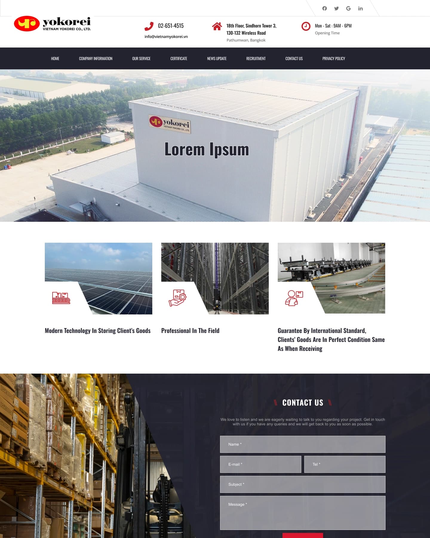
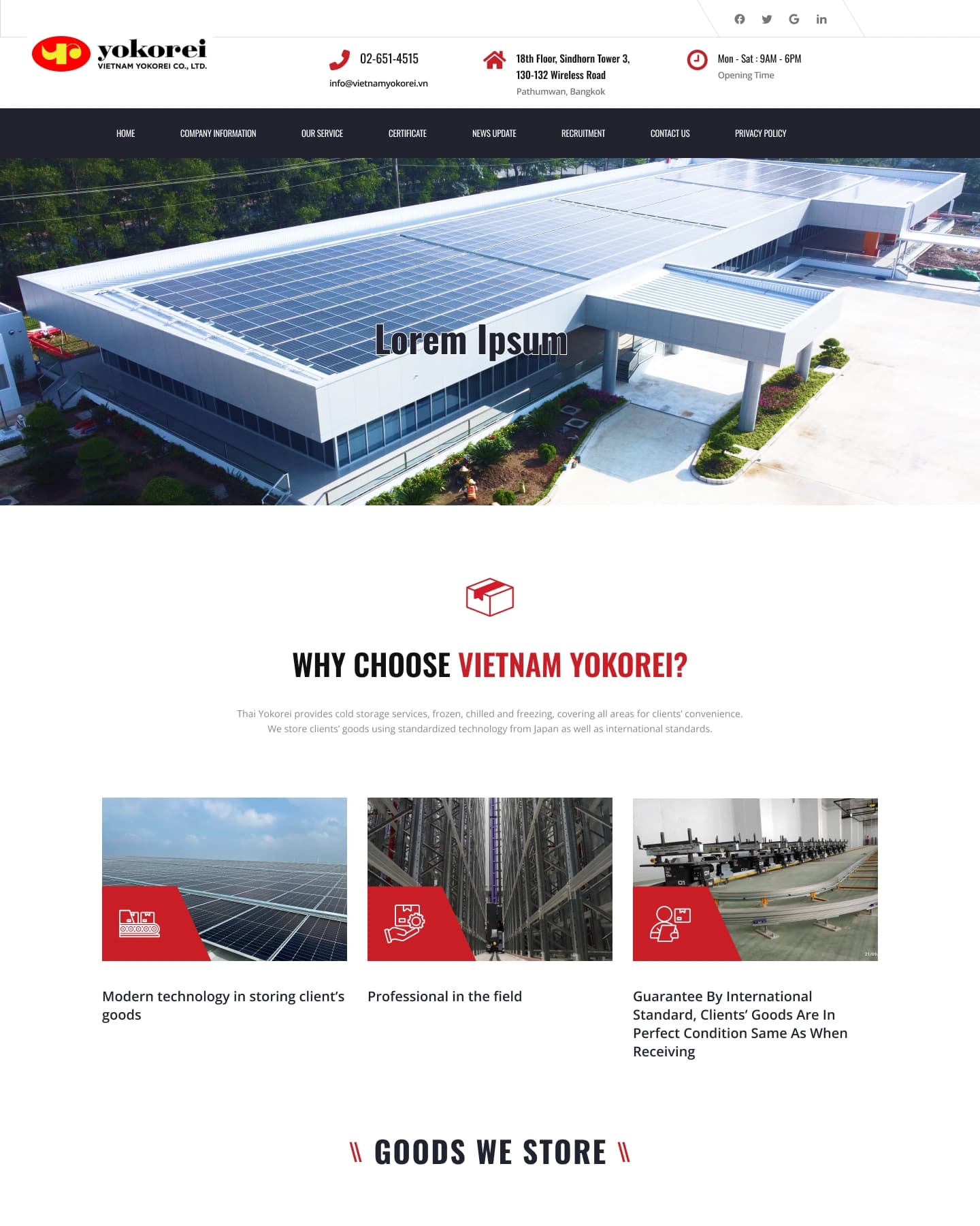 CORPORATE WEBSITE / UI REDESIGN
Original desktop designs supplied by the designer. Home and Service excerpts are paired above; full-page images are available below.
Redesigned every page of an existing corporate website to give it a modern visual presentation, using the original website content.
The brief was to update the visual design of the existing Vietnam Yokorei website to make it look more modern. My role covered UI design for all pages in Figma, with content taken from the existing website.
The goal was to modernize the website’s visual presentation while retaining the existing content. My contribution focused on screen design; the development team handled responsive adaptation and implementation.
The UI redesign covers these eight pages. This overview follows the page links in the shared header navigation and shows the scope of the visual redesign.
The following notes describe visible hierarchy, grouping and CTA placement in the supplied screens. They are observations of the interface, rather than unconfirmed accounts of the designer’s reasoning.
A full-width warehouse photograph leads into three capability cards. A dark contact band separates the enquiry form from the white service grid; a second red Contact Us action appears further down the page. These are visible layout and CTA patterns, rather than confirmed statements of design intent.
The service page moves from three capability cards to a two-column goods category grid, then a row of four operational services. Red line icons and repeated angled panels visually connect these groups; a dark location section closes the main content.
A large map precedes a two-column contact area. Address and telephone details sit on the left; the form groups Name, E-mail, Tel, Subject and Message on the right. A solid red Send Message button sits directly below the message field.
These specimens are direct excerpts from the supplied designs. Repeated typography, form fields, buttons, header and footer can be observed; component states, font names and Figma variables are not inferred.
Values sampled from the supplied PNGs, not a claim of original design tokens or brand specifications.
Tall, condensed bold headings contrast with smaller sans-serif paragraphs. Red emphasis and paired diagonal marks recur in section headings. Typeface names and sizes are not inferred from raster images.
The Contact export shows thin bordered text fields, a larger message area and a solid red Send Message button. This specimen records the visible default appearance only.
The logo and contact information sit above a dark horizontal navigation bar. The same structure appears across all eight supplied screens; logo authorship is not claimed.
A dark footer groups About Us, Information and Office into three columns, with red angled section labels. The specimen is a direct crop of the Contact export.
Six desktop layouts, selected for their different content structures. Previews show the upper portion where necessary; enlarge an image to scroll through the full design without changing its proportions.
07 / THE NEXT CHAPTER
Explore the original design file and the other projects in this portfolio.
UI design by Sirinya. Content from the existing website. Responsive adaptation by the developers.